
Developer tools
Three things you reach for when writing business pages: the component sandbox shows every component in the library, lets you tweak its props and copy the code; the component library packages/ui depends on none of the repository’s business packages and can be moved wholesale into another React project; the frontend / backend contract packages/api generates types offline from the backend’s OpenAPI.
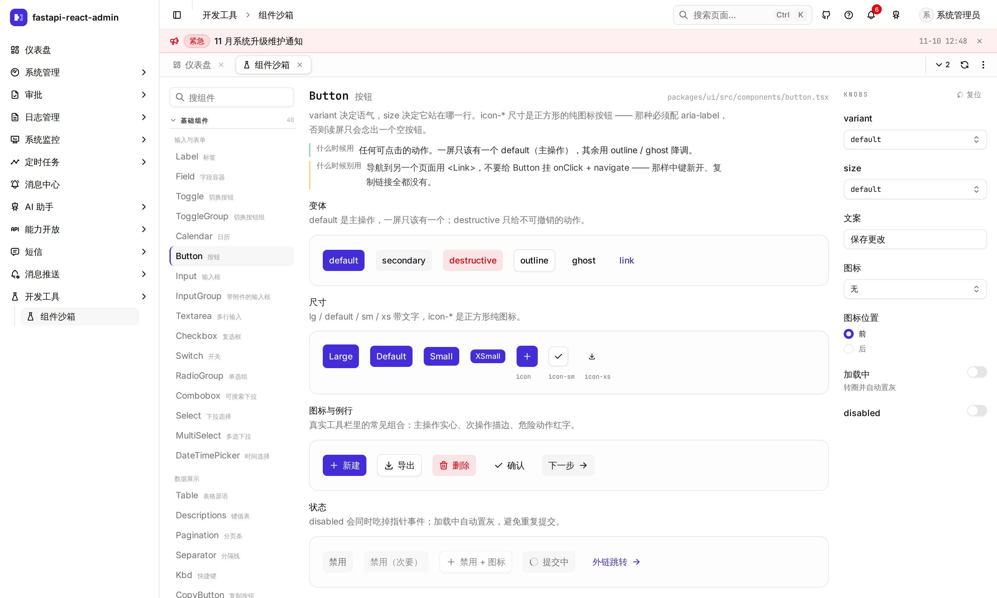
Where is it in the UI?
Section titled “Where is it in the UI?”| Entry | Path | Who |
|---|---|---|
| Sidebar Developer tools → Component sandbox | /sandbox/components | Any signed-in user; appears in the sidebar only while the sandbox is on |
| Filter bar playground | /sandbox/query | Any signed-in user; linked from the sandbox, not in the sidebar |
| Table playground | /sandbox/table | same |
The Developer tools sidebar node is not in the menu table: the frontend adds it while the sandbox is on, so it uses no permission code and does not appear under Menus. Whether the sandbox is on is decided by DEV_SANDBOX_ENABLED in Config → Advanced → Development: the seed data sets it to true; if the key is missing, it is on in development and off in production. Turn it off in Config before going live if you don’t want people to see it. The sandbox reads the switch through a dedicated endpoint that returns only those two booleans, so it does not need permission to view Config.
What is in the component sandbox?
Section titled “What is in the component sandbox?”49 demos in groups: inputs and forms, data display, feedback and status, overlays, navigation, tables, composite features, and theme. The page has three columns:
- Left: pick a component, with search
- Middle: the stage and the code. Change a knob and the stage updates live, and so does the code, which lists only props that differ from the defaults, ready to copy
- Right: the knobs (the props this component exposes)
Each demo also says where to use it, where not to and where its source is. The current component and the search term go into the URL, so a shared link opens the same view; knob values do not (they are a draft and mean nothing for another component).
The palette (in the theme group) reads the colour tokens actually in effect on the page, not a hard-coded swatch: switch the accent colour or dark mode in Profile and it follows. It also shows radii and the type scale. Colours in business code should only come from these tokens, never a hand-written #rrggbb or emerald-500.
The filter bar (QueryBar) and the data table have too many options for the sandbox’s small stage, so each has its own playground that lays its options out to try (the table one switches between server pagination and full scrolling, grouping, sorting, dragging, density and stripes).
Can the component library be moved into another project?
Section titled “Can the component library be moved into another project?”Yes, by design: packages/ui has not a single import from the repository’s other packages (even translations are injected at run time), and pnpm arch:check enforces that in CI. The steps are in packages/ui/PORTING.md:
- Copy the components and styles under
packages/ui - Install the npm packages it depends on
- Take
globals.cssalong and point Tailwind’s@sourceat your own source directory; get it wrong and nothing errors, every button just turns black on white - Translations, one of three: wire nothing (the original Chinese text shows), wire your own i18next, or strip translation out
- Check against the list at the end of the document: do buttons have a background, does the table header stick while scrolling, does the pager say
42 totalor{{total}} total, does dark mode invert everything
There is also a readable component catalogue in packages/ui/AGENTS.md, covering when to use each component and pitfalls such as size overrides that don’t take effect.
Where does the frontend / backend contract come from?
Section titled “Where does the frontend / backend contract come from?”pnpm --filter @admin/api gen:api imports the backend’s FastAPI app directly to get the OpenAPI spec and generates packages/api/src/schema.d.ts. No running backend is needed (generating a contract has nothing to do with runtime). Run it after backend endpoints change.
The package also holds the request client and the success rule: only code === 200 in the envelope means success, HTTP 200 is not enough. The backend’s fail() returns HTTP 200 with code: 400, so a client that only looks at the HTTP status reads every business failure as a success.
Where type inference stands, plainly:
- Mobile infers the path, parameters, body and response fields of every request from
schema.d.ts, so an API change the screens didn’t follow failspnpm typecheck(mutation-tested: a wrong field name, path, body field or query parameter name are all caught). - The web client has not switched yet: its request wrapper is
api.GET<T>(path: string), with the path a plain string and the response typeTwritten by hand at each call site, so a field renamed in the backend is not caught by the web type check. A few structural issues stand in the way (dynamically built paths, about 20 pages that build query strings with functions); details are inpackages/api/AGENTS.md.
What other checks guard the code?
Section titled “What other checks guard the code?”All run in CI and can be run locally:
| Command | Checks |
|---|---|
pnpm typecheck --force | Types. Use --force: on a turbo cache hit the printed log is the previous run’s |
pnpm lint | ESLint for every package (run it as pnpm <task>, not --filter one package, or the others never get checked) |
pnpm arch:check | Dependency direction between packages, pages not reading the router directly, global DOM queries inside hidden tabs, product tour targets that exist… |
pnpm i18n:check | Chinese and English keys match |
pnpm ctx:check | Files, scripts and test IDs mentioned in each directory’s AGENTS.md still exist |
The background of these rules is in the “hard rules” section of the root CLAUDE.md.
What it does not do
Section titled “What it does not do”- The sandbox demonstrates
packages/uicomponents only, not business pages. - The Developer tools node is not in the menu table, so roles cannot control who sees it: when it is on, every signed-in user can.
- The web client’s API types are not inferred from the contract yet; see above.
Where is the code?
Section titled “Where is the code?”- Sandbox:
pages/dev-sandbox/(demos/holds each demo,api.tsthe switch) · playgroundspages/playground-query/·pages/playground-table/· the sidebar node inshell/use-sidebar.ts - Component library:
packages/ui/· theme tokenspackages/ui/src/styles/globals.css - Contract:
packages/api/(generatorscripts/gen.mjs) - Check scripts:
scripts/
Try it on the demo
Section titled “Try it on the demo”On the live demo (admin / 123456), open Developer tools → Component sandbox at the bottom of the sidebar, pick Button, set variant to outline and size to lg on the right, and see that the code in the middle gained exactly those two props; then open the palette, switch the accent colour in Profile and come back to compare.